Welcome on the justification page! Here we will explain how and why this website has come together
as it is now. The Urthly website communicates the feeling of being clean and sustainable, and based
on this, all design and website-flow deciscions have been made. Below you will find
specifically how it all came together.
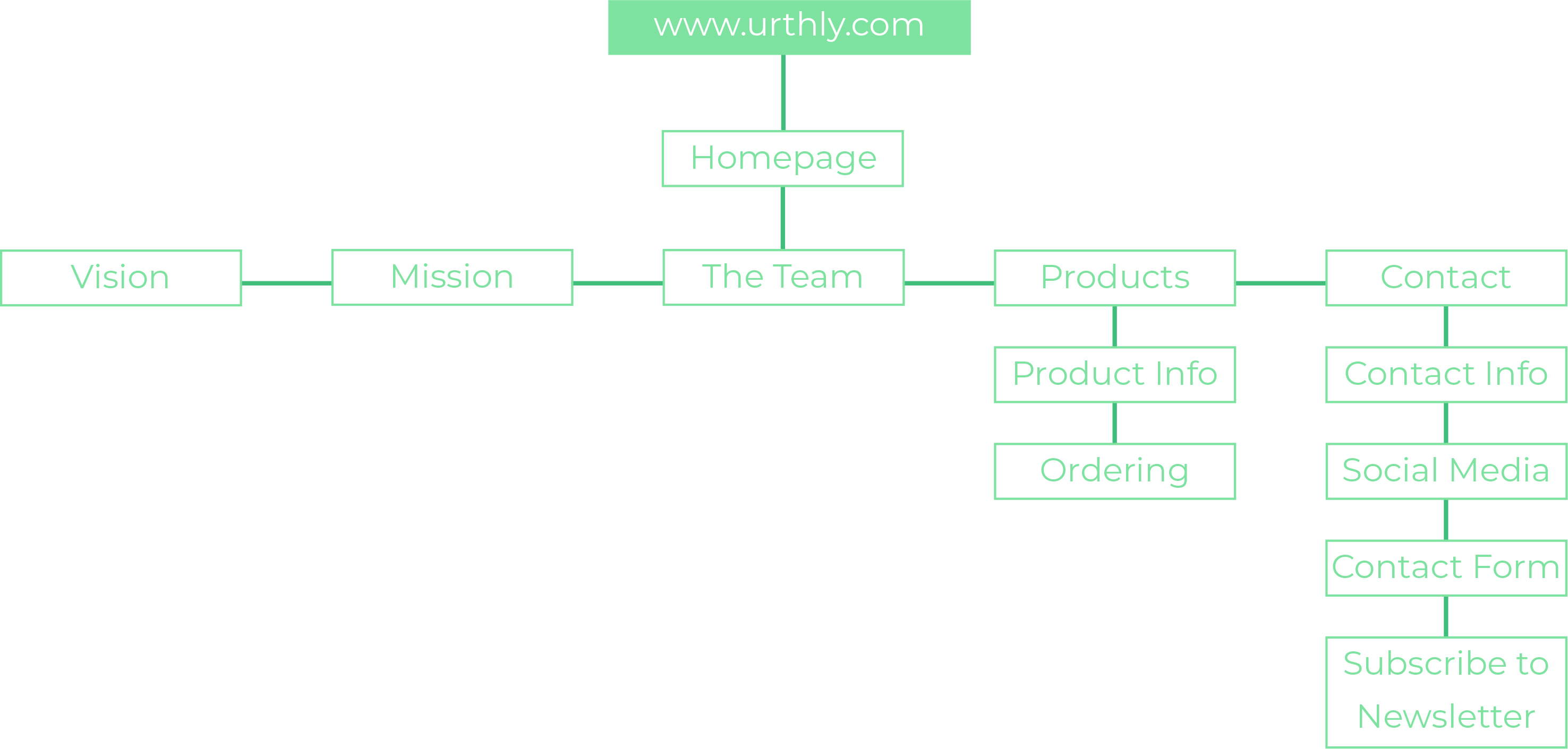
As Urthly is a brand with many different aspects, such as creating the content, making perfect website-flow, coding the website and selecting the best kind of products to sell, the Urthly team has made a clear division of tasks within building this website. We are a group of students who learn a lot from each other and make sure everyone is present in the entire process, but everyone is responsible for their own aspects of the website. Below are the team members described with their own aspects and responsibilities from the website, to show the entire team has made an equal and essentail contribution.
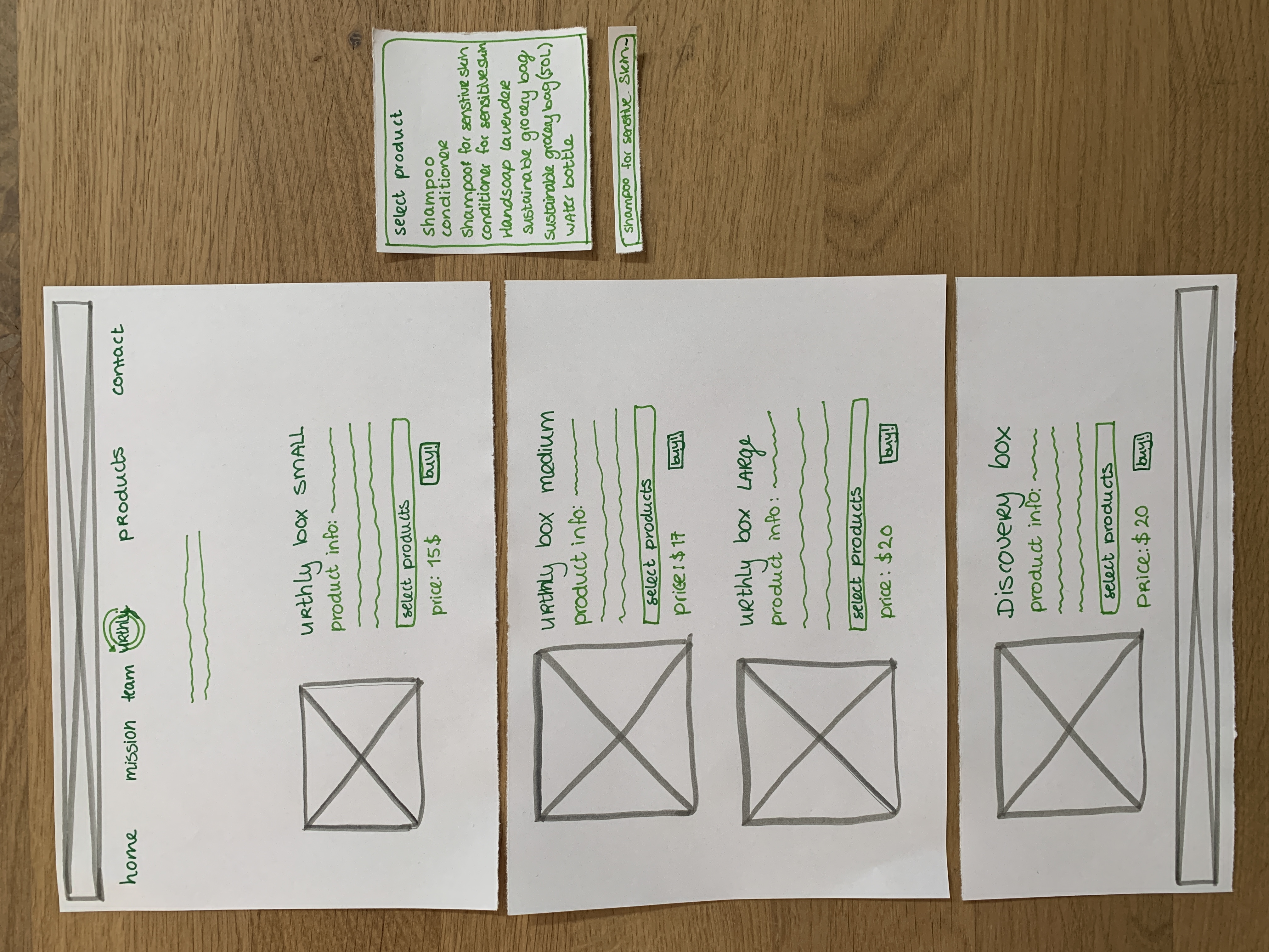
Joëlle Donkers: On the Urthly Website, Joëlle is responsible for selecting the best collection of sustainable products. She will look into the best pricing, the right amount of products per box, and keeping it exciting for our customers to buy our Discovery Box. She is also Head of Marketing, and looks after our social media accounts.
Felipe Sperling: As the website requires a few pages, Felipe is responsible for creating the best website-flow. He researched and tested our prototypes, and drew conclusions from this to come up with a plan to improve the Urthly website. A first paper version turned into a specific prototype, and that's how he developed a well-flowing plan for the entire website, together with team member Floris.
Floris Brugman: Together with his teammate Felipe, Floris was also responsible to creating a nice website flow and did some tests to make sure people would use the website as we thought they would. If there were any problems, he would make sure to find solution's. He makes sure the entire website is in line with the mission and vision Urthly tries to carry.
Tess Grijpma: Tess is one of the two teammembers who are responsible for the back-end of the website, which means she is responsible for coding everything on the home and products page that Floris and Felipe create, test and improve. She makes sure the code is correct and works as the prototype.
Anouk van den Hout: Together with Tess, Anouk is also responsible for coding the website and making sure everything works as desired. She lays the focus on the justification and contact page, where the plans and improvements from Floris and Felipe all come together nicely. Together with the team, she makes sure that the website communicates Urthly's vision, mission and products nicely.
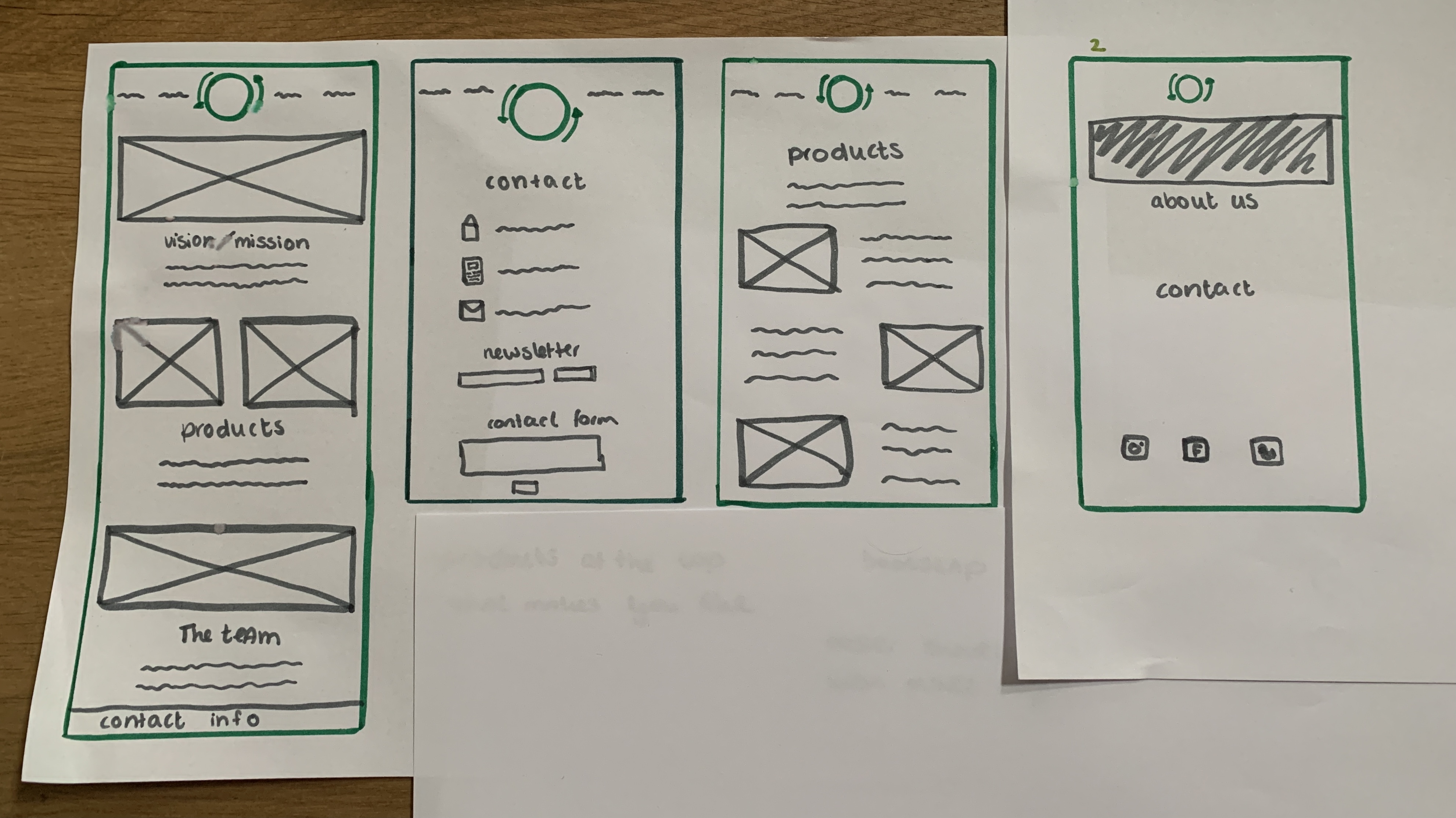
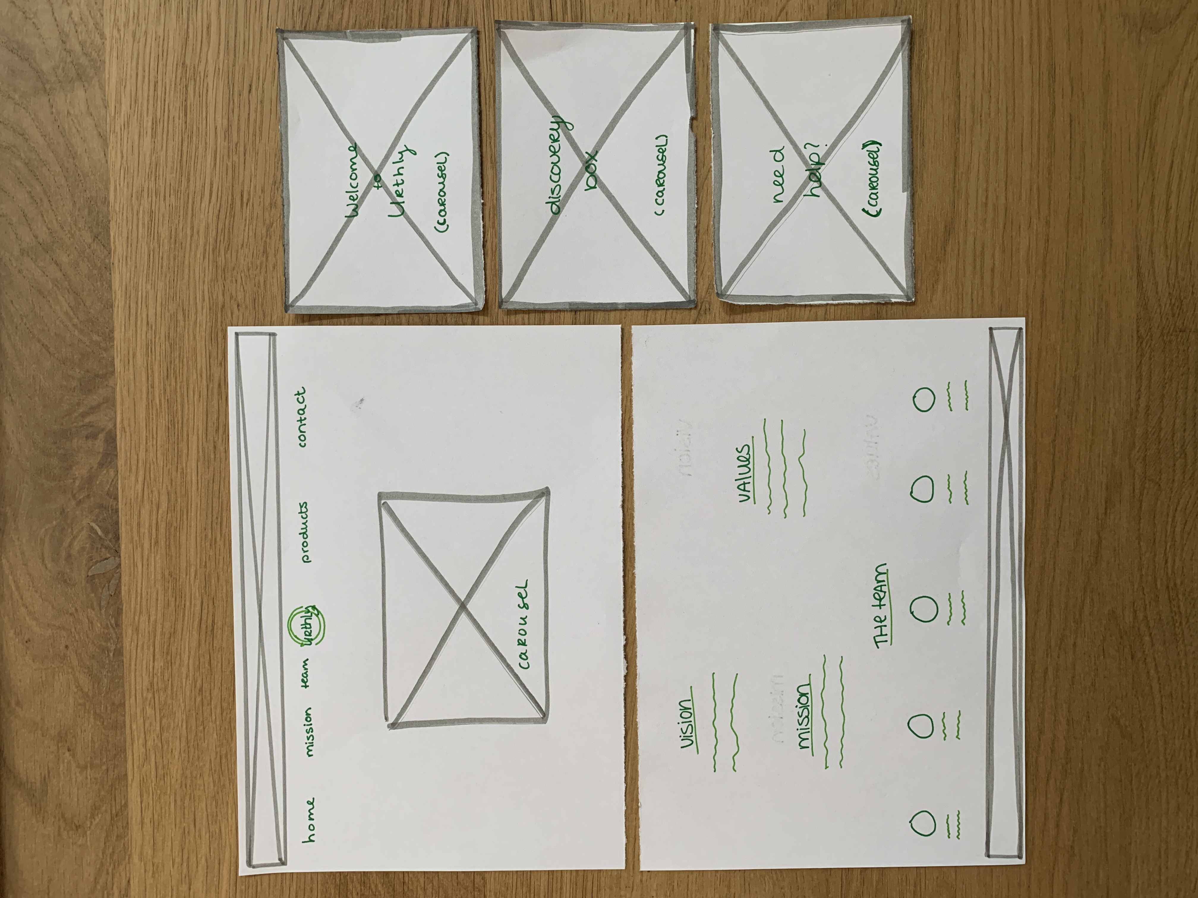
The paper prototype consists of all three website pages, and a few options which the users could 'click' on. The pages are split up in length, so that a user could 'scroll' through the website. The paper prototype was mostly used to test the navigation through our website, to see if all elements were placed in a logical location and if the user did not have any big troubles.
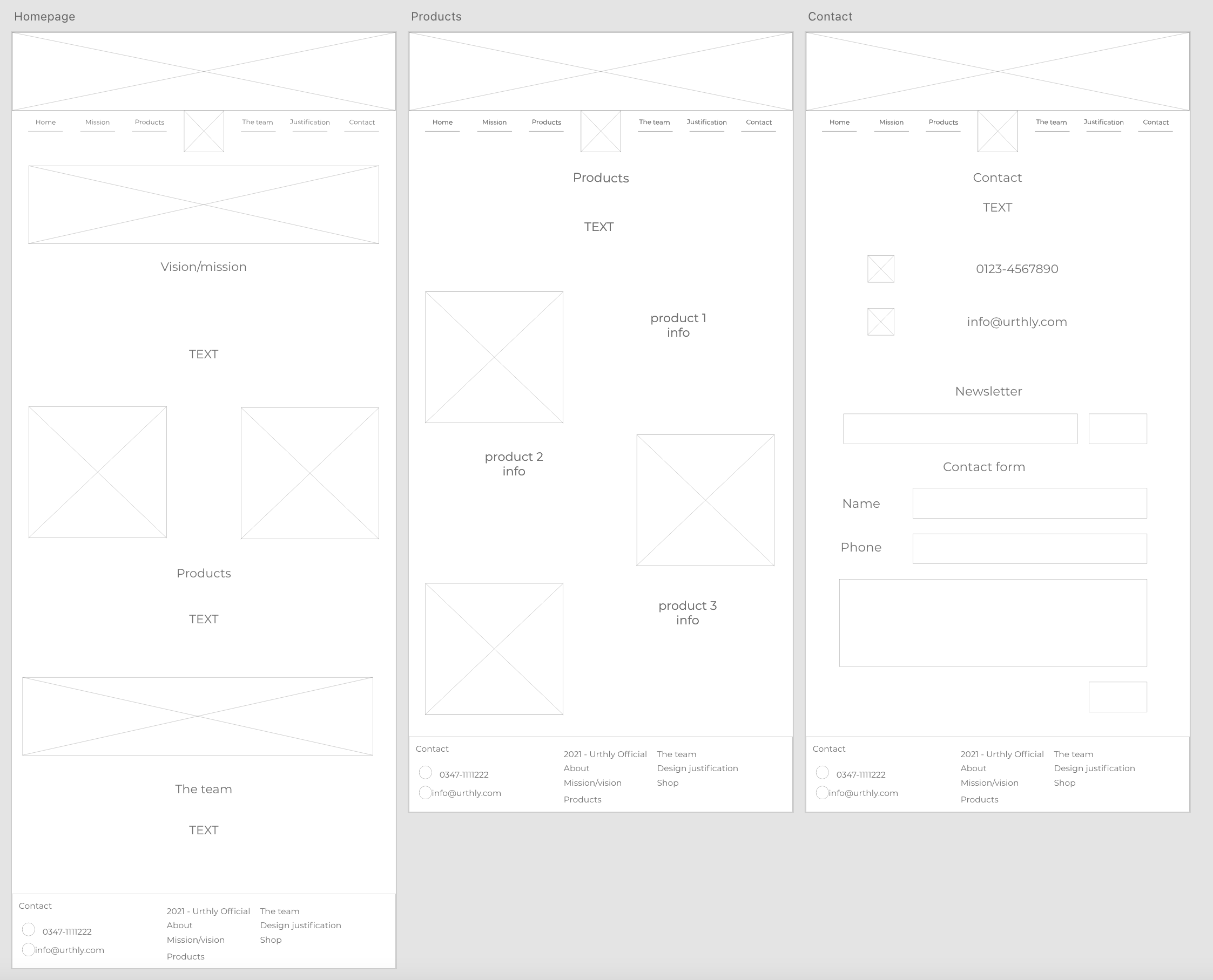
Next to the paper prototype, we also used the first version of our website to test it with users. As the base of our website was already functional and we applied the feedback from the paper prototypes tests, using the first version of the website was a good choice. This showed us more improvements, which you can find in our recommendations for the future and further developments for the Urthly Website.
Used Methods - Test Conditions and Scenarios - Number of tests
For the testing phase, we made sure to do Usability Testing. We let the user test the prototype by first letting them experience the website. With the paper prototype, whe laid the paper in front of them. With the digital prototype, we put a computer with the homescreen in front of the user. We did not say anything yet, and we let them figure out how it worked. During this process, we asked the user to tell us about the things he/she was doing. This was so we could take notes and understand what they were thinking at that moment.
An important aspect, especially within the paper prototype, was letting the user test the prototype without correcting them. This was how we would find some mistakes. After they indicated that they experienced the website, we followed up with specific questions. These questions made sure we tested the most important aspects of the website, such as finding and ordering products, contacting us and reading about our mission as a brand.
In total we did 5 tests, all with people from the target audience of our brand.
With testing the paper prototype, the first reaction of the user was positive. With 'clicking' they were able to navigate to the few different pages of our website. What we noticed, that even though we had a home button in the navigation bar, most of the users click the logo when they want to go back to the home screen. We realised this was important and implemented it in our digital prototype. The users said it was clear which types of products Urthly has to offer, and that they liked the option of buying a discovery box to get surprise elements.
The digital prototype, the first version of our website, was already a more specific and we could ask the user to test more. We asked the user to select a specific type of products, to contact us via social media and to find the companies team. As we already tested in the paper version, the digital version also showed that the flow of our website was clear. There was no trouble in finding the different pages.
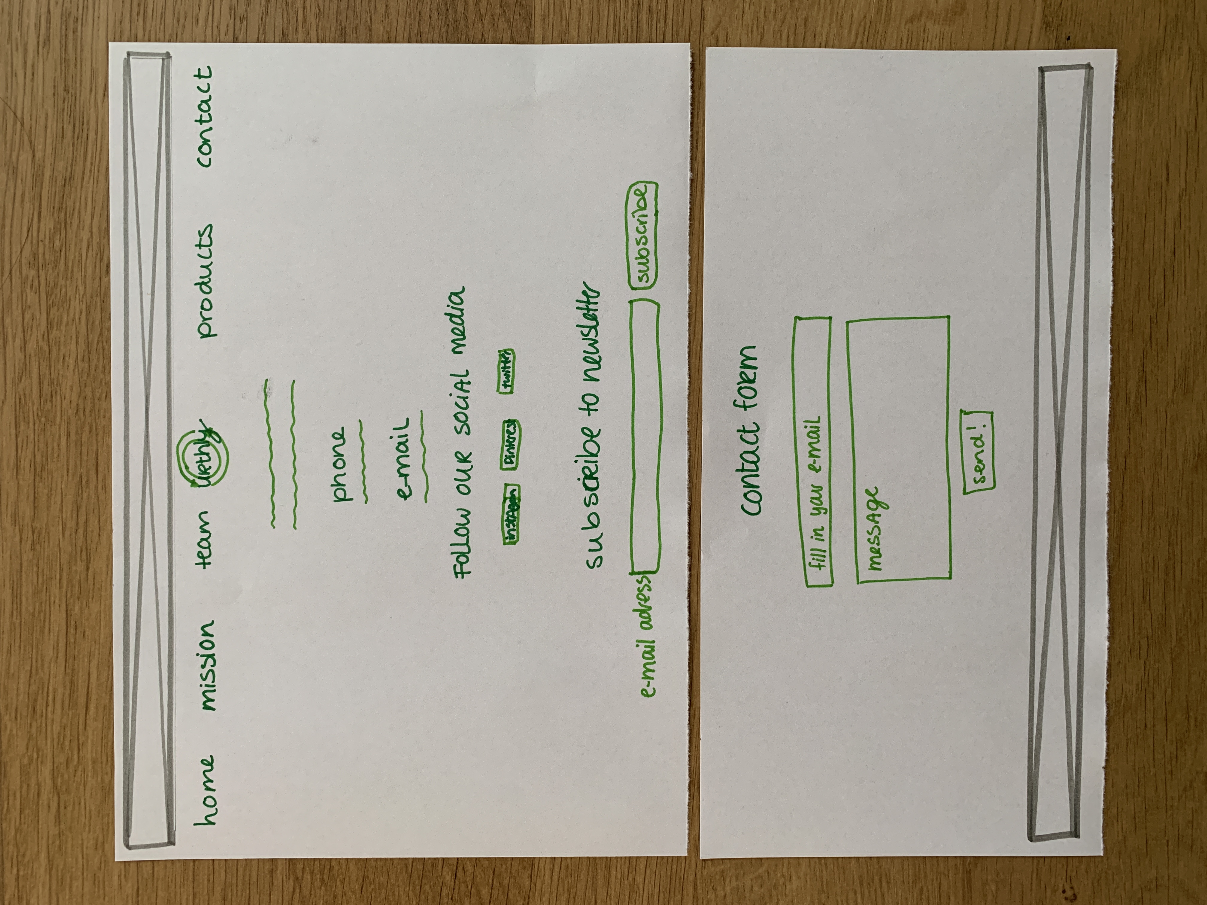
However, there were some issues which Urthly can improve for their future website. For the users it was sometimes unclear how to select different products within one box. They would also like to see more info about the products. Also, the homepage with the mission and vision were a bit chaotic to read, they found. And lastly, when they contacted us via the contact form, there was no 'sent' notification so they weren't sure if their message was sent.
Recommendations for the Future Website
For the future developments of the Urthly website, we as a team recommend the following few things:
- Create a more organized layout for the vision, values and mission on the homepage.
- Add more information about the products, including images.
- Make sure a pop-up notification appears on the screen when a user subscribed to the newsletter or contacted Urthly.
There are other elements which we can add once the brand Urthly has had the time to grow, such as special offers, behind-the-scenes information about the process of the sustainable products, or a more expanded selection of products.